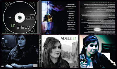
This is a digipak made by a student, I personally think the design of this is quite good as they've kept the colours and design are consistant throughout. One thing I don't like about this is how the images don't flow very well, each has extremely different lighting and looks as if they've been taken with different cameras or edited differently. Another thing I dislike is the wall of writing that is in the top right corner, this is something I want to avoid with my digipak as people may not want to read such a large amount of text. I will also try and keep all images consistant so that they flow.
Adele's genre is generally seen as a mix of pop and soul, I'd say the soul aspects into consideration this digipak fits the conventions of something from that genre, they use a dark colour scheme mixed with some light tones such as the glass and the images of the girl. Other than the quality of the images, this digipak looks quite professional especially the CD, though I think it may look nicer if "ADELE" and "21" were in line with each other.


