Dean Chalk A2 Media - 1201
Showing posts with label Research & Planning. Show all posts

Thursday, 12 March 2015

Student Advert Analysis

This is an advert made by a past media student, looking at it I can straight away see some things I would do differently. The images are quite low quality so I'd ensure those were higher, the text is also hard to read due to how small it is and the colour of the background/text makes it even harder to read.


Another thing that I would change it the layout of the advert, the text seems to be all over the place and doesn't flow very well, I do however like the idea of the image, with the microphone being left on the floor but I feel like this is an advert aimed at people who are already fans of the band as if it was aiming at new fans it would show images of the band so they can see.

Friday, 6 March 2015

The Script #3 Advert Analysis

This is a poster advertising The Script's album, #3. As with most male bands, there is one person, usually the lead singer, who is seen as the figurehead of the band and most advertising is based around them, as seen in this advert where Danny's head is the largest and the other band members are layered over the top of his head.


In this advert, there is a 2/3 split, where at the top of the page the band's name and the name of the album are displayed, the image of the band members is directly in the center of this advert, making it the first thing that you see and specifically, as his image is largest, Danny is the first band member that you notice which impies that he is the lead singer.

At the bottom of the page, there is information about when the advert is due to be released and a link to their website. I like this advert as it is simplistic and to the point, there aren't any quotes from reviews or anything trying to promote how good the band is which keeps it clean and for that reason I would assume this advert is directed towards people who are already fans of The Script as opposed to the advert aiming to attract new fans.

Thursday, 5 March 2015

Video Mood Board

Follow Dean's board Video Mood Board on Pinterest.

Production Schedule

We will split up our shoots into the different scenes so we're able to complete multiple scenes on one day, these are the things we will be filming together:

Shoot 1)

  • Cafe Scene - Where both Renatas and Rosie are sitting in a cafe at the window, a bus goes past (which we will then edit so that Rosie disappears as it goes past)
  • Train Scene - We will film them on a train together, we will be able to do this while on the train when we're on our way to film other scenes (such as outdoor filler footage and the cafe scene)
  • Outdoor filler footage (walking in a park) - He/they will be walking in a park, he will also be singing whilst doing this.


Shoot 2)

  • Indoor filler footage (singing) - He will be singing with a guitar, singing whilst sitting in a chair and singing for the initial line of the song where the camera will move around him.
  • Fireplace scene - Here he will be burning photographs of them together in the fireplace, here we'll also get footage for the transition into the train scene.
  • Fight scene - Only their bodies will be in the scene and we'll make sure their body language makes it clear that they're fighting.
  • Bonfire Scene - They will be sitting around a bonfire with some friends, we will need to get footage of them sitting apart from each other  noticing each other and then sitting with and laughing with each other.
  • Ending scene - They notice each other from across the road and go their separate ways.


Shoot 3)

  • Time-lapse filler footage - Time-lapse of clouds moving across the sky, busy streets (both cars and people), trees and their shadows moving.
By Dean

Name Selection

Luke - 3 votes
Eric- 0 votes
Luka - 0 votes
Lewis - 0 votes
Jayson - 1 votes
Jordan - 1 votes
Taylor - 2 votes

Green - 0 votes
Black - 1 votes
Grey - 2 votes
Hayes - 2 votes
Wilde - 1 votes
Drake - 0 votes

In the end we chose to have 'Luke Grey' as our frontman's name considering it suited well with Renatas as a person.

Wednesday, 4 March 2015

Animatic

Emma drew out pictures to have in our animatic, I then scanned them into the computer and edited them using Adobe Premier Pro to get everything in time, this is a rough outline of how we plan for our video to look. Some things may still be edited as they will look different when using actual footage and things may have to be changed, but for now this should give a general idea of how the video will look.


Update 16/04/15:
We have had to replace a few scenes with different things, most of them are still the same concept but are just done differently. We are changing the beginning campfire scene to them being in a park when they meet as we couldn't find anywhere that the campfire would look good and don't have enough people available for it. We're also changing the cafe scene, instead of a bus going past and her disappearing we will have them sitting together in a restaurant and the camera will pan between them both, eventually she will be gone.


Saturday, 28 February 2015

Student Digipak Analysis


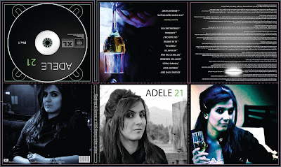
This is a digipak made by a student, I personally think the design of this is quite good as they've kept the colours and design are consistant throughout. One thing I don't like about this is how the images don't flow very well, each has extremely different lighting and looks as if they've been taken with different cameras or edited differently. Another thing I dislike is the wall of writing that is in the top right corner, this is something I want to avoid with my digipak as people may not want to read such a large amount of text. I will also try and keep all images consistant so that they flow.

Adele's genre is generally seen as a mix of pop and soul, I'd say the soul aspects into consideration this digipak fits the conventions of something from that genre, they use a dark colour scheme mixed with some light tones such as the glass and the images of the girl. Other than the quality of the images, this digipak looks quite professional especially the CD, though I think it may look nicer if "ADELE" and "21" were in line with each other.

Digipak Analysis

This is the digipak for Maroon 5's album, overexposed.


Straight away there is a clear theme with the cartoonish style and the colours all matching throughout the digipak, the only exception to this is the CD itself which is black, but seeing as Maroon 5 is a pop rock band, the rock side of their band can justify the use of black. As for the other colours they are clearly conventions of a pop band due to the bright colours and even the cartoons which can be seen as fun and not taking things seriously fit into the conventions of pop.

On the back of the CD, where the barcode and record label's logos are you can see the list of songs that are featured on the album, these are all written in decorative fonts which are all different styles, but close enough matches to let them flow and look good next to each other. The font on the front of the album is also decorative but stands out a lot more than the ones on the back do, mainly due to the background on the front of the album being very colourful and the writing of their logo being white.

I like how this album's digipak looks specifically the layout and how well put together the fonts and cover is, the layout looks professional and flows well, I will be keeping in mind what they've done with this digipak whilst we create ours and see if there is any inspiration we're able to take.

Friday, 27 February 2015

Logo Experimentation (First Draft)


This was the logo design that I suggested to Emma (the words linking into a heart beat monitor) and she was able to create it using Adobe Photoshop. I think she definitely has the basis of how I imagined this could look and did a great job, though I agree with her that it may be necessary to use a different font, or having to resort to using our own handwriting to get it to look as good as we want it to.

Artist Photoshoot

Emma recently did a photoshoot with Renatas (the star of our music video), I was unable to attend as I was busy during half term and was given quite short notice about the photoshoot that was being done therefore I didn't have time to prepare, but seeing as due to Emma's absence I presented our team's pitch by myself we've now evened out the work load.

The total amount of images in this photoshoot was 398 which is great and will be very useful when it comes to creating our digi-pak and advert as we'll have a wide variety of shots to choose from.


Thursday, 12 February 2015

Image Schedule

We will do a photoshoot during the half term sometime of Renatas, the person who will be playing the role of our artist.

Wednesday, 4 February 2015

Minor Change

The actor that we were going to use, Boris, has dropped out and we are instead using Renatas as the male actor for our music video now.

Equipment List


This is the equipment that we will need when we go out to film our music video.
  • Tri-pod
  • 2 Camera's (DSLR)
  • Umbrella's
  • Phone (Back up Recording and Contact)
  • Adobe Photoshop/Premier Pro
  • Spare Batteries
  • SD Cards
  • External hard drive

Advert Research

Follow Emma's board Advert Research A2 Media on Pinterest.

Thursday, 29 January 2015

Wednesday, 17 December 2014

Student Music Video Analysis


This is a video made by past media students which I enjoyed and have taken inspiration from. Aspects of this video that I particularly enjoyed were the time lapses of the sky with the clouds rapidly moving across the sky and the sun setting, I also liked the time lapse which they did showing the shadow of the tree moving and would like to incorporate similar techniques into my music video if possible.

Another thing that looked good was the fire burning with the sunset in the background, this fit well with the theme of the video and the composition of the shot was well done, with the colours of the sunset contrasting with the fire and then the actor standing by the fire to make the shot more dramatic and interesting.

The lens flares which can be seen throughout the video along with the desaturated colours in most of the shots make the video look professional and the lighting of the video is exceptionally well done, it is a huge part of what makes this video look so good. Another aspect which made this video look good was the skill of the actors, keeping a serious attitude throughout the video and not breaking character, which is something that happens in a lot of the other music videos made by students.

Thursday, 11 December 2014

Animals Updated Video


I edited the colours a bit and fixed a few timing issues that there were in the previous video that I posted on my blog.